Rebound
A brand built on harmony, collaboration, and growth.
Rebound is a multi-disciplinary practice dedicated to helping people reconnect with an active lifestyle and rediscover the joy of doing what they love. With services spanning podiatry, physiotherapy, dietetics, exercise physiology, occupational therapy, and women’s health, Rebound fosters meaningful connections and inspires purpose-driven care across all aspects of health and wellness.
Scope
Brand Strategy
Brand Identity


Who Are Rebound?
Rebound is more than a practice—it’s a community. At its core, Rebound champions harmony, collaboration, and care, creating a welcoming and relaxed environment that motivates clients and practitioners alike. Rooted in a coastal, professional, and approachable ethos, Rebound is a beacon for talent and a hub for purpose-driven healthcare.
Our Approach
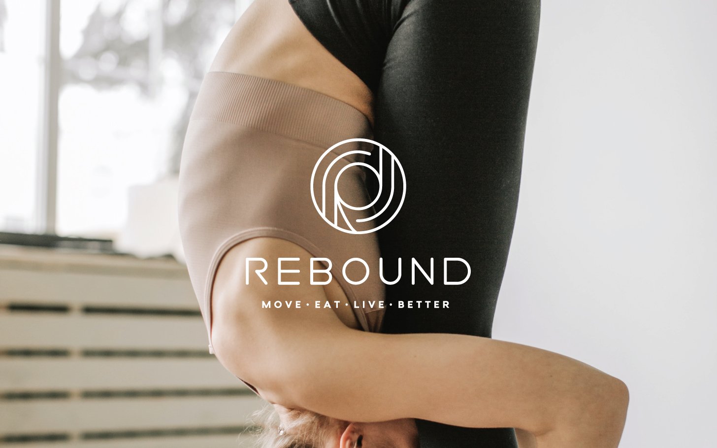
The challenge: to craft a brand identity that reflects Rebound’s values of connection, evolution, and care while visually capturing its relaxed, coastal vibe. The logo design is central to this identity—a beautifully rounded mark that symbolises movement and growth. Subtle yet impactful, it incorporates the “R” in a way that embodies the evolving nature of Rebound’s mission and services.
The visual language extends to a cohesive suite of print and digital collateral, balancing professionalism with approachability. Warm, earthy tones and thoughtful design details echo the brand’s coastal roots while ensuring a polished and modern feel.


The Brand in the Making
Rebound’s identity was built with harmony in mind. The rounded logo design reflects movement and evolution, representing the journey of bouncing back into an active and fulfilling lifestyle. Every element, from typography to colour palette, was chosen to create a sense of calm, care, and connection.
The messaging emphasises Rebound’s mission of nurturing collaboration in healthcare, amplifying social impact, and fostering meaningful connections between practitioners and clients. Together, these elements form a brand that feels both inspiring and deeply rooted in its purpose.
The End Result
Rebound’s new brand identity beautifully captures its vision, creating a welcoming and motivating presence that resonates with clients and practitioners alike. The combination of thoughtful design and intentional messaging ensures Rebound stands out as a leader in multidisciplinary healthcare.
From the movement-inspired logo to the collaborative ethos woven into every touchpoint, Rebound is a brand that doesn’t just reflect its mission—it amplifies it. This is more than healthcare; it’s about helping people and practitioners alike find balance, purpose, and connection.


Kind words from Rebound
“I loved working with Jess! Right from the outset, she was able to take the ideas in my head and feed back inspired and creative designs that were right in line with our brand and our business. I'd recommend Jess and Sunstone Studio to anyone.”
Andrew Daubney - Founder