Katrina Mackintosh
Layered interiors, thoughtfully designed.
Katrina Mackintosh is a Sydney-based interior design studio creating refined homes that feel deeply personal, beautifully considered, and effortlessly lived in. Every space is guided by emotion as much as aesthetics, balancing timeless design with warmth, craftsmanship and an intuitive understanding of how people want to live.
This project was about far more than creating a visual identity. It was about distilling the feeling behind Katrina's work into a brand that feels just as calm, elegant and enduring as the homes she designs.
Scope
Brand Strategy
Brand Identity
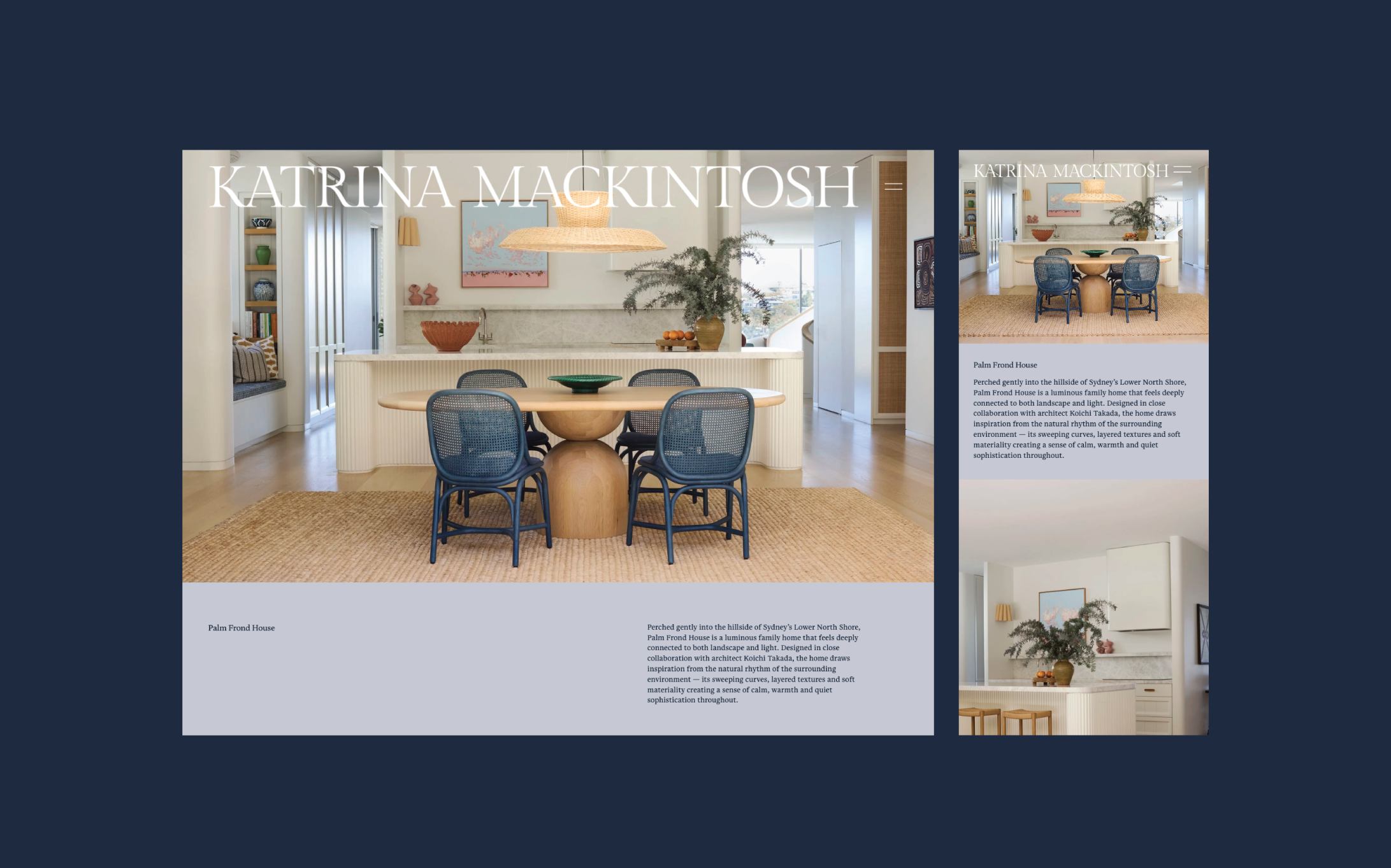
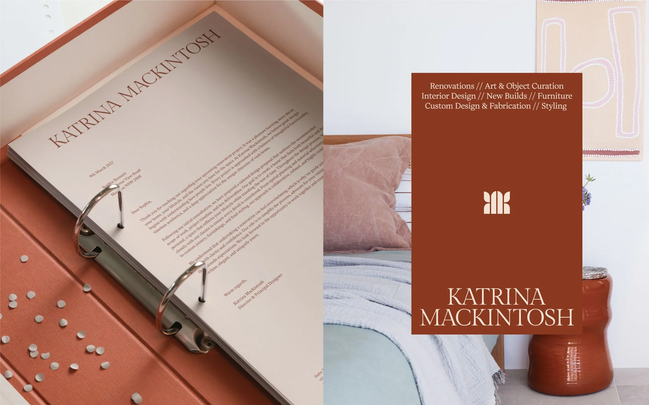
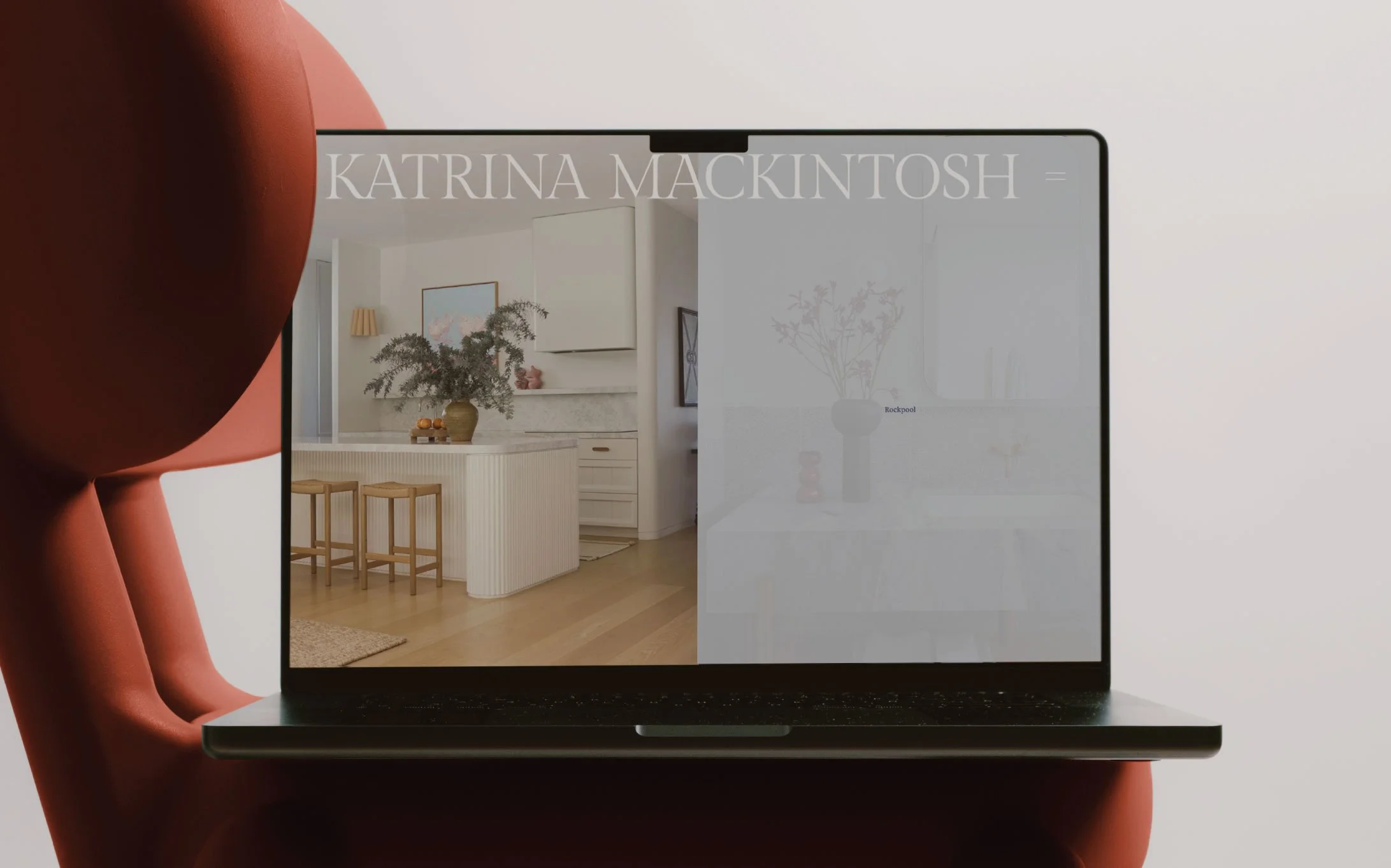
Website Design
Social Media
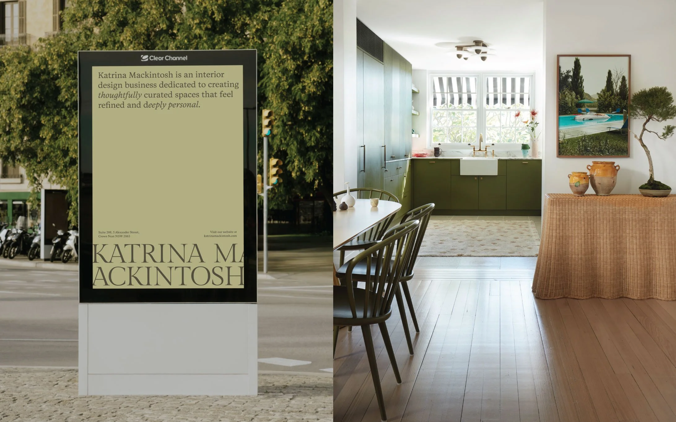
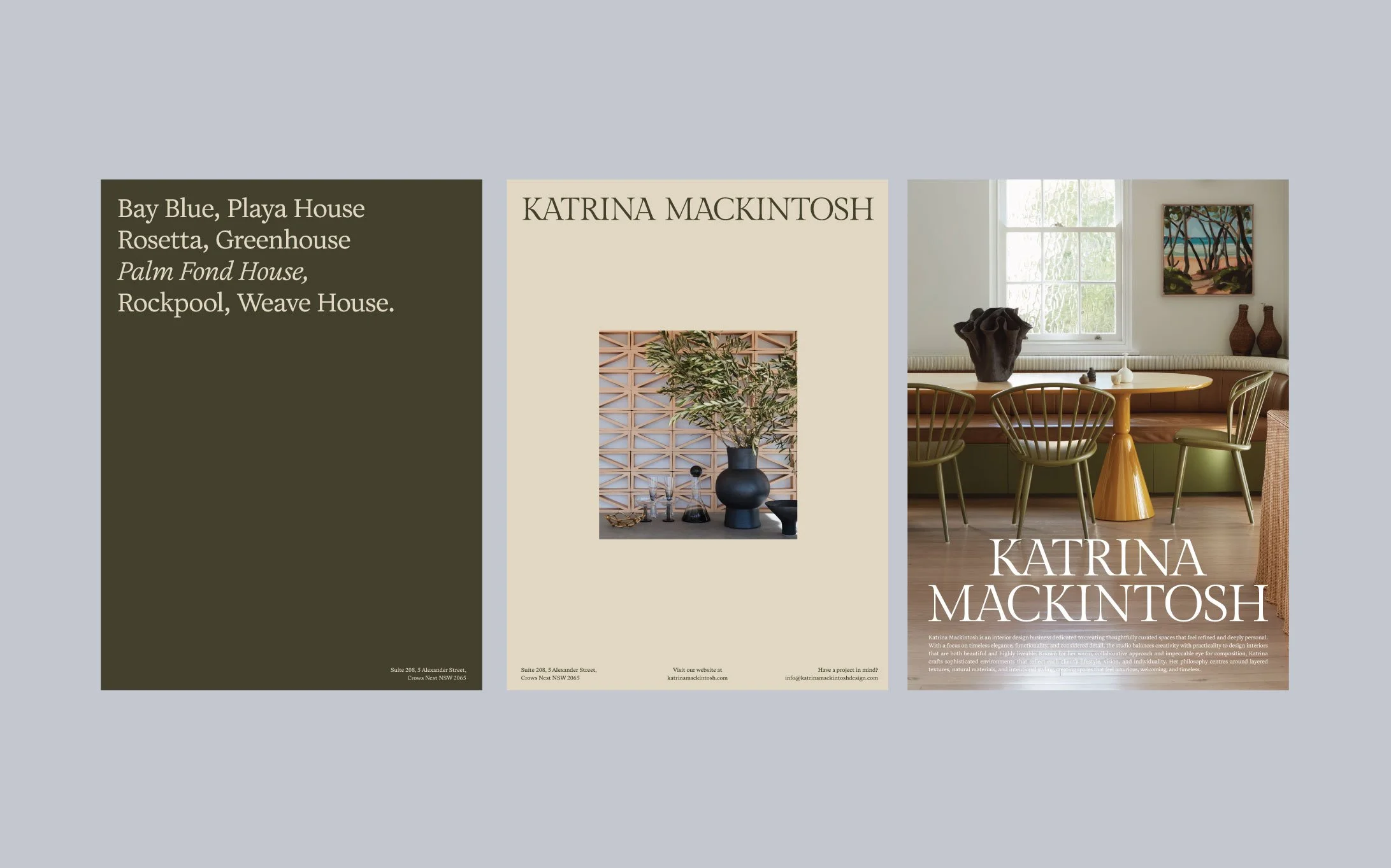
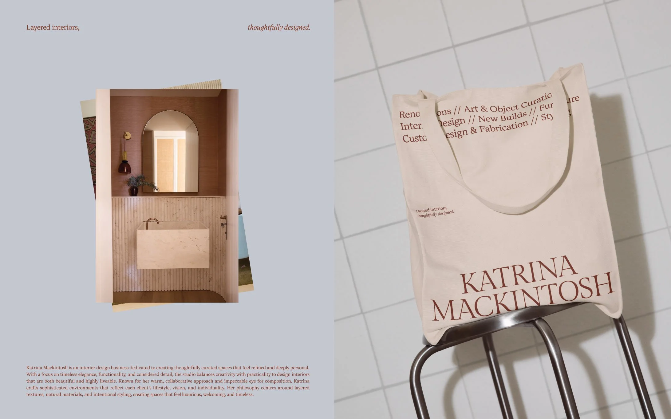
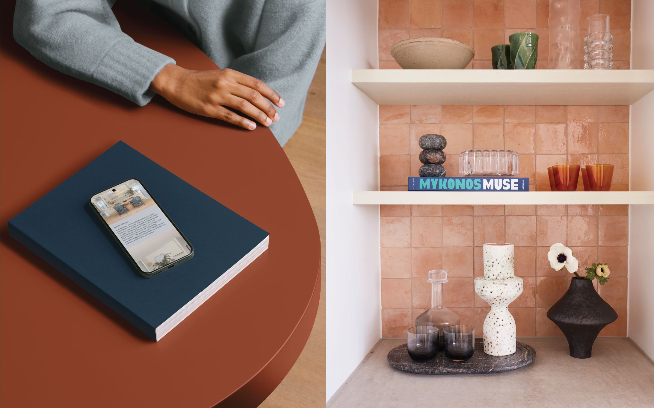
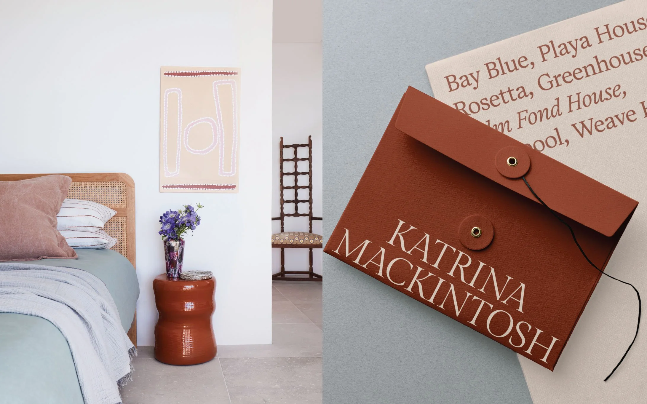
Digital & Print Assets
Who Is Katrina Mackintosh?
Katrina Mackintosh is an interior designer with a deeply personal approach to creating homes that are as functional as they are beautiful. Every project begins with listening — understanding not only how a client wants their home to look, but how they want it to feel.
Her work is grounded in timeless design principles rather than passing trends, embracing natural materiality, thoughtful spatial planning and exceptional craftsmanship. The result is a collection of homes that feel layered, soulful and quietly luxurious — spaces that evolve beautifully over time and become a true reflection of the people who live within them.
Our Approach
From the very beginning, our goal was to create a brand that reflected Katrina's design philosophy rather than simply showcasing her portfolio. We wanted every visual element to embody the same feeling clients experience when stepping into one of her interiors — calm, effortless, welcoming and beautifully considered.
The visual identity was built around quiet luxury. Rather than relying on trends or decorative flourishes, we embraced restraint, allowing simplicity, balance and thoughtful detail to become the defining characteristics of the brand.
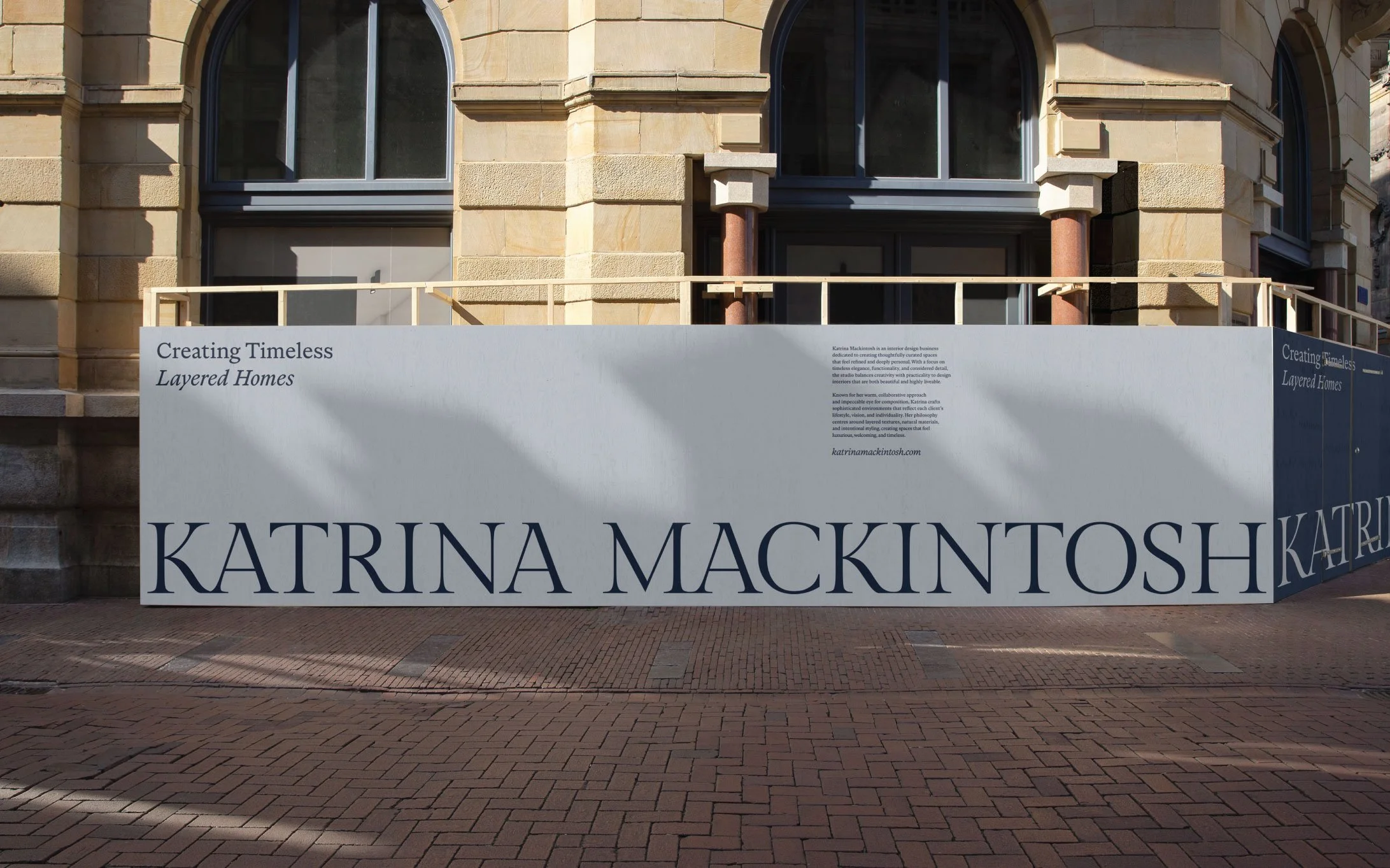
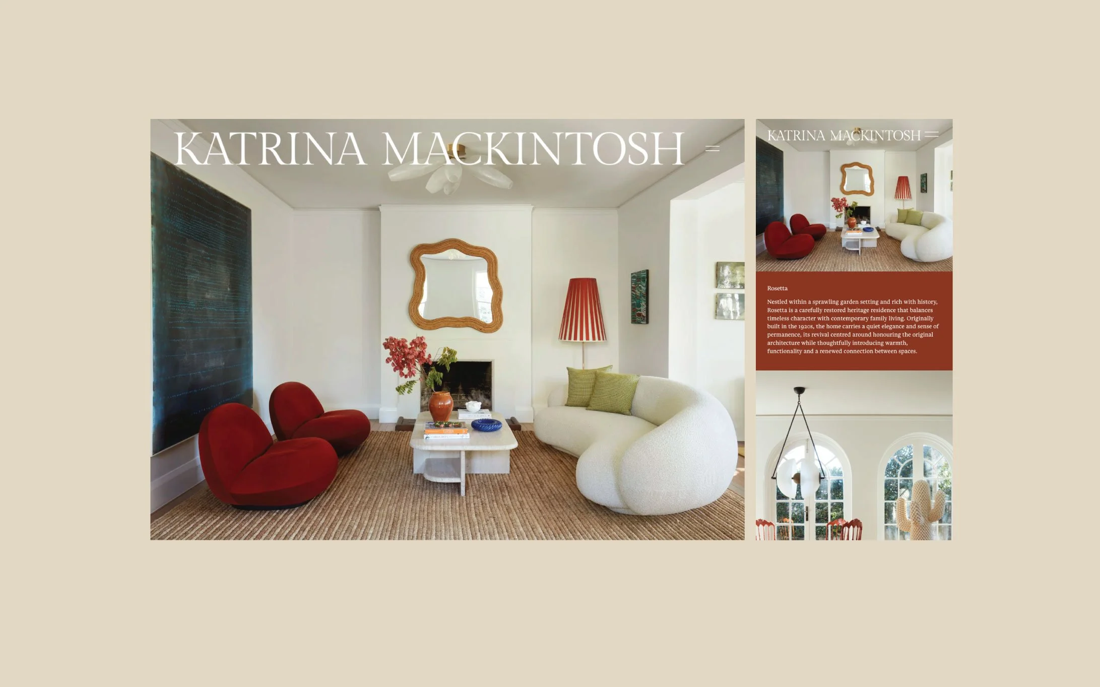
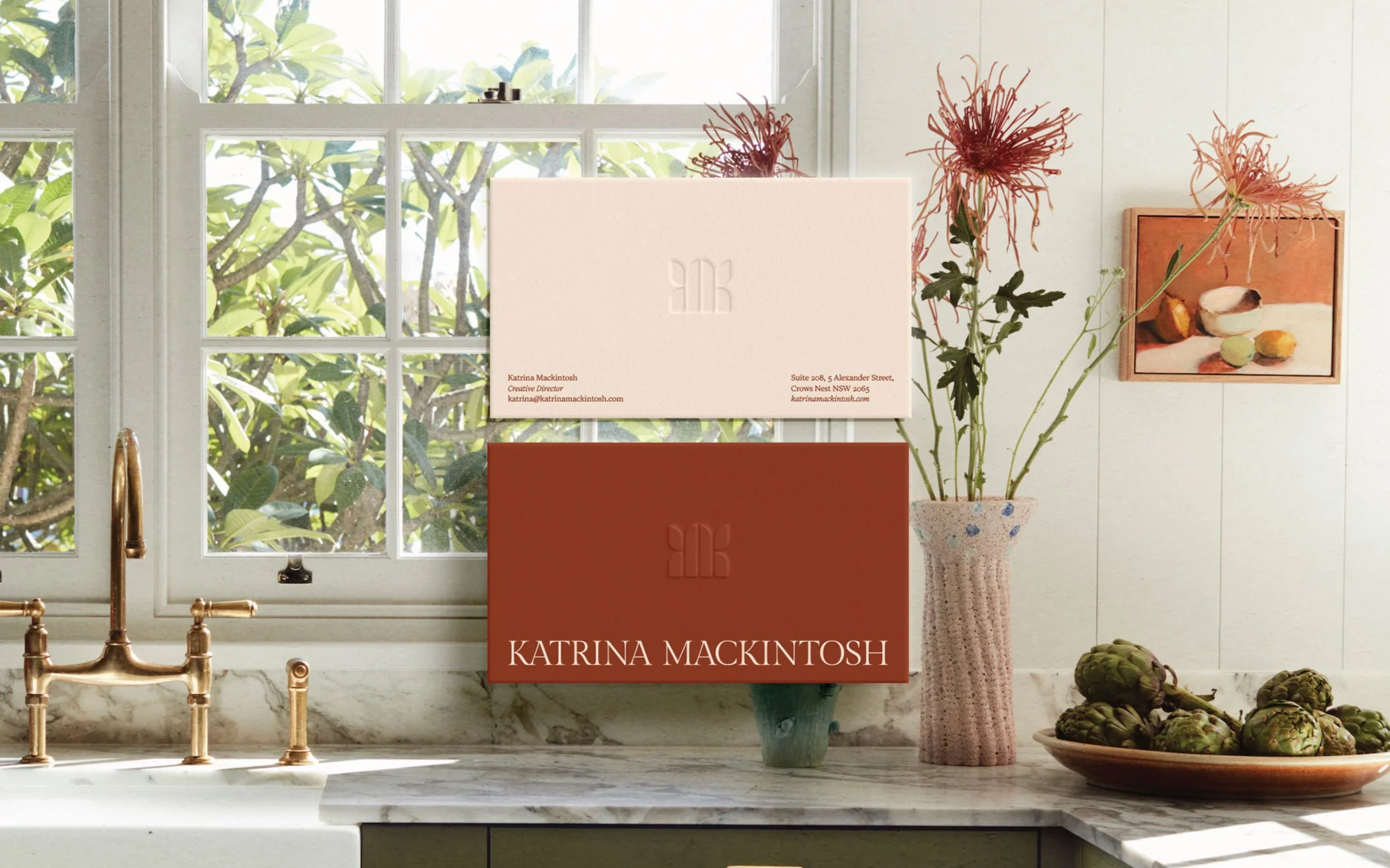
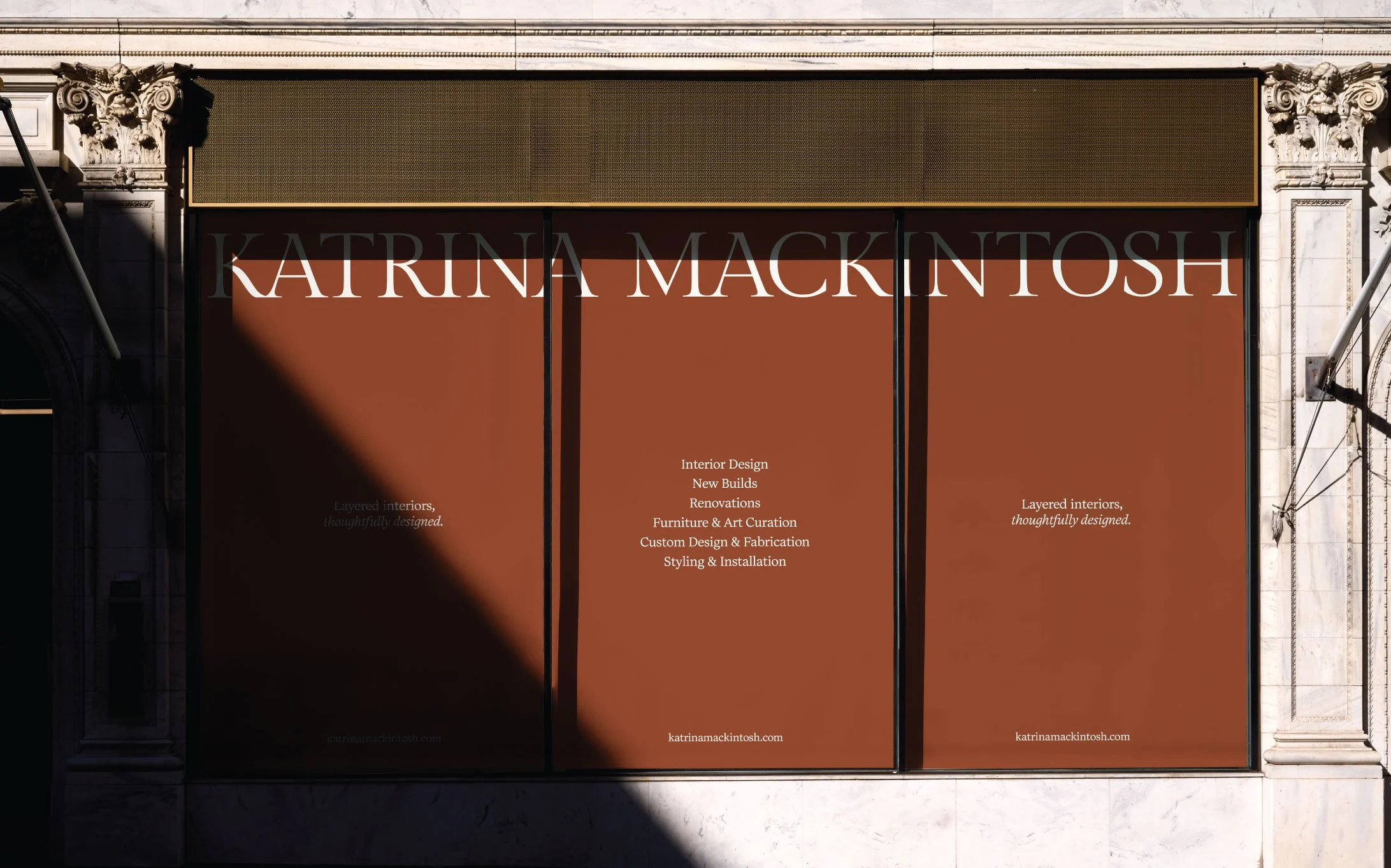
The typography plays a significant role in expressing this feeling. Elegant serif letterforms bring a timeless architectural quality, while the refined supporting typography introduces clarity, sophistication and contemporary ease. Together they create a visual language that feels editorial, elevated and enduring.
The colour palette was inspired by the natural materiality found throughout Katrina's interiors. Warm stone tones, soft coastal blues, earthy neutrals and rich muted accents work together to create a palette that feels grounded, tactile and effortlessly elegant. Every colour was chosen to evoke a sense of calm, warmth and emotional connection rather than simply complement beautiful interiors.
We also designed a bespoke monogram that subtly intertwines the letter K, creating a timeless symbol that reflects craftsmanship, considered detail and understated luxury. Like Katrina's interiors, the mark is quiet in its confidence — simple at first glance, yet layered with intention.
Across the website, photography direction and social media, we leaned into generous white space, full bleed imagery, editorial layouts and imagery that allows texture, light and materiality to tell the story. The brand never feels crowded or overly designed — instead, it breathes, creating the same sense of ease found within Katrina's work.
The Brand in the Making
Every decision throughout this project was guided by one simple question:
How should this brand make people feel?
The answer became the foundation of every creative decision.
We wanted the experience of discovering Katrina Mackintosh to feel like walking into one of her homes — immediately calm, quietly luxurious and deeply welcoming. Rather than designing a brand around trends, we built an identity designed to endure. One that balances sophistication with softness. Editorial refinement with genuine warmth. Minimalism with emotional depth.
This philosophy extended across every touchpoint — from the logo and typography to the website experience, brand messaging and visual storytelling. Together, they create a seamless brand that reflects not only what Katrina designs, but why she designs it.
The End Result
The result is a brand that feels unmistakably aligned with the studio it represents. Quietly confident. Thoughtfully refined. Beautifully timeless. Katrina Mackintosh now has a visual identity that mirrors the integrity and craftsmanship of her interiors while positioning the studio within the premium residential design space.
More than simply creating a logo, we created a complete brand experience — one that communicates warmth before words are spoken, craftsmanship before details are explained, and trust before the first conversation begins.
Working alongside Katrina throughout this journey has been an absolute privilege. Her intuitive eye, unwavering attention to detail and genuine passion for creating meaningful homes made this one of those projects that reminds us exactly why we do what we do.